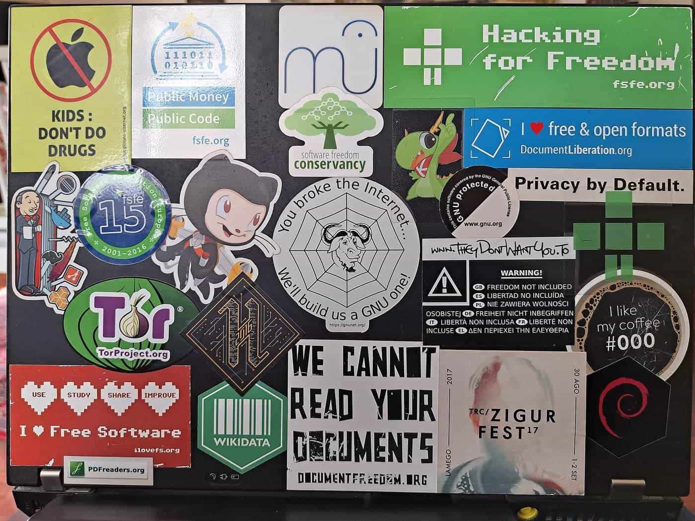
A sticker is a tiny poster that has to work at a glance, often on a curved bottle, a busy laptop lid or a car bumper seen from across a car park. Designing one that looks great and prints cleanly takes a few deliberate choices: the right size, readable type, strong contrast, and technical setup that matches what the printer or cutter needs. This guide covers both the design and the technical side.
Bleed
Extends past the cut
Avoids white edges
Safe zone
Keep text inside
Away from the cut
CMYK
Print colour
Screens use RGB
Start with where the sticker will live
Before opening design software, answer:
- What surface? Flat or curved, smooth or textured, light or dark?
- What viewing distance? Arm's length on a jar, a few metres on a car, across a room on a window?
- Indoors or outdoors? This affects material and colours as well as design.
- What's its job? Brand recognition, information, decoration, a seal, a warning?
The answers drive size, level of detail and how much text you can fit.
Size and shape
Measure the space where the sticker will go and mock it up at actual size: print it on paper, cut it out and stick it on with tape. You'll quickly see whether text is readable and whether the shape suits the surface.
Simple shapes such as circles, squares, rectangles and ovals are easy to produce. Custom die-cut shapes follow your design's outline and look striking, but very intricate outlines with thin spikes can tear or peel. Keep a smooth outline with no very narrow parts.
Our sticker sheet planner helps you see how many stickers of a given size fit on a sheet, which can influence your choice of size.
Readability
Stickers are read quickly, often at an angle or a distance. To keep them readable:
- limit the words: one main message, plus perhaps a website or handle;
- use clear fonts: simple sans-serif or slab fonts work well at small sizes; save script and decorative fonts for large display words;
- make the main text big: it should be readable from the expected viewing distance;
- avoid tiny text near the edges and on curved surfaces;
- use strong contrast between text and background.
The Australian Government Style Manual's accessibility guidance emphasises sufficient colour contrast and not relying on colour alone to convey meaning. Those principles help everyone, including people with low vision or colour blindness.
Colour
Design files are usually set up in one of two colour modes:
- RGB (red, green, blue light) is used by screens.
- CMYK (cyan, magenta, yellow, black ink) is used by most printing processes.
Some bright, saturated screen colours, especially vivid greens, blues and oranges, can't be reproduced exactly in CMYK. Design in CMYK or convert early so you can see realistic colours, and always ask for a proof.
For brand colours that must match exactly, ask your printer about spot colours, which use pre-mixed inks. For printing on clear or dark materials, you may need a white ink layer under the colours.
Bleed, safe zone and cut line
These three terms come up with every printer.
- Cut line (die line): the path where the sticker will be cut. Supply it as a separate vector path or layer, as your printer specifies.
- Bleed: extra background artwork that extends past the cut line, so that a slightly misaligned cut doesn't leave a thin white edge. Printers commonly ask for a few millimetres; use the printer's template.
- Safe zone: an area inside the cut line where important text and logos should stay, so they're not trimmed off or crowded at the edge.
If you want a white border around a die-cut sticker, design it deliberately, rather than relying on cutting tolerances.
Resolution and file formats
- Vector artwork (made of paths, such as logos and text created in illustration software) scales to any size without losing sharpness. Printers usually prefer vector for logos, text and cut lines.
- Raster images (photos and painted artwork) are made of pixels. Supply them at a high enough resolution for the final printed size, or they'll look blurry or pixelated. Your printer can tell you what resolution they need.
- Print-ready PDF is a common delivery format, with fonts embedded or converted to outlines.
Follow your printer's specification sheet exactly: it saves time and avoids surprises.
Designing for cut vinyl
Cut-vinyl decals, such as lettering for windows and vehicles, are cut from solid-coloured vinyl by a plotter, not printed. That changes the rules:
- designs must be solid shapes in one colour per layer;
- no gradients or photos;
- very thin lines and tiny letters may not cut or weed cleanly;
- letters must be connected or held in place by application tape;
- each colour is a separate layer of vinyl.
Copyright and trade marks
Only use images, fonts and logos you have the right to use. IP Australia explains that copyright protects original creative works automatically, and trade marks protect brand names and logos. Using someone else's artwork, characters or logo without permission can infringe their rights. Check font licences too: some free fonts don't allow commercial use.
Proofing checklist
Before you approve a print job:
- Check spelling, phone numbers, websites and handles character by character.
- Check text sits inside the safe zone.
- Check bleed extends past the cut line.
- Check colours on a printed proof, not just on screen.
- Check the size is correct.
- Print at actual size and look at it from the real viewing distance.
- Get a second person to check it.
Common mistakes
- Too much text in too small a font.
- Low-contrast colour combinations, such as yellow on white.
- Low-resolution images copied from websites.
- Missing bleed, leading to white slivers at edges.
- Important text too close to the cut.
- Forgetting a white underprint on clear stickers.
Briefing a designer or printer
If someone else is designing or printing your stickers, a short written brief saves time. Include the size and shape, the material and finish, where the sticker will be used, the quantity, your logo files, any text that must appear exactly, your brand colours, and your deadline. Ask the printer for their template and specifications before design starts.
Designing a set or series
If you're creating a set of stickers, such as for a club, a product range or a campaign, keep a consistent style across them: the same fonts, a shared colour palette, similar border treatments and a consistent logo position. A set looks deliberate and builds recognition. Design them on one artboard so you can compare them side by side, and check that each still works on its own.
Key points
- Design for the real surface, size and viewing distance.
- Keep messages short, fonts clear and contrast strong.
- Set up bleed, safe zones and cut lines using your printer's template.
- Use vector artwork for logos and text, and high-resolution images.
- Only use artwork, fonts and logos you have the right to use.
Frequently asked questions
What is bleed?
Bleed is extra artwork that extends beyond the cut line, so there's no thin white edge if the cut is slightly off. Printers commonly ask for a few millimetres; follow your printer's template.
What file format should I send?
Most printers prefer a print-ready PDF or a vector file (such as AI, EPS or SVG) for logos and text. If you use images, supply them at a high enough resolution for the print size. Check your printer's specifications.
Why do colours look different when printed?
Screens display colour in RGB light, while most printing uses CMYK inks. Some bright screen colours can't be reproduced exactly in CMYK. Ask for a proof and, for brand colours, discuss spot colour options.
How small can text be on a sticker?
It depends on the font, contrast, material and viewing distance. Print a test at actual size and check it from the distance people will read it.
Can I use any image I find online?
No. Images, fonts and logos are usually protected by copyright or trade marks. Use your own work, properly licensed material, or content you have permission to use.
Sources and further reading
Facts on this page were checked against these primary and official sources. Conditions change — confirm before you travel or buy.
- Copyright basics — IP Australia
- Trade marks — IP Australia
- Accessibility and inclusivity (Style Manual) — Australian Government Style Manual